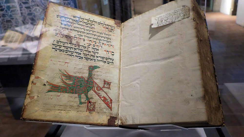
With its breast and one of its feet, the green-and-red bird at the bottom of a 14th-century manuscript page forms the leftmost leg of an aleph. The oversize aleph itself, “decorated,” or weighed down, with three other monstrous forms, appears beneath a section of the morning service from a prayer book likely originating in the Franco-German Rhineland, a region then controlled by the Holy Roman Empire. In the 15th century, in an instance of forced interfaith recycling, the whole manuscript page, complete with its bizarrely fantastic aleph, was reused to bind an edition of a Christian theological work.
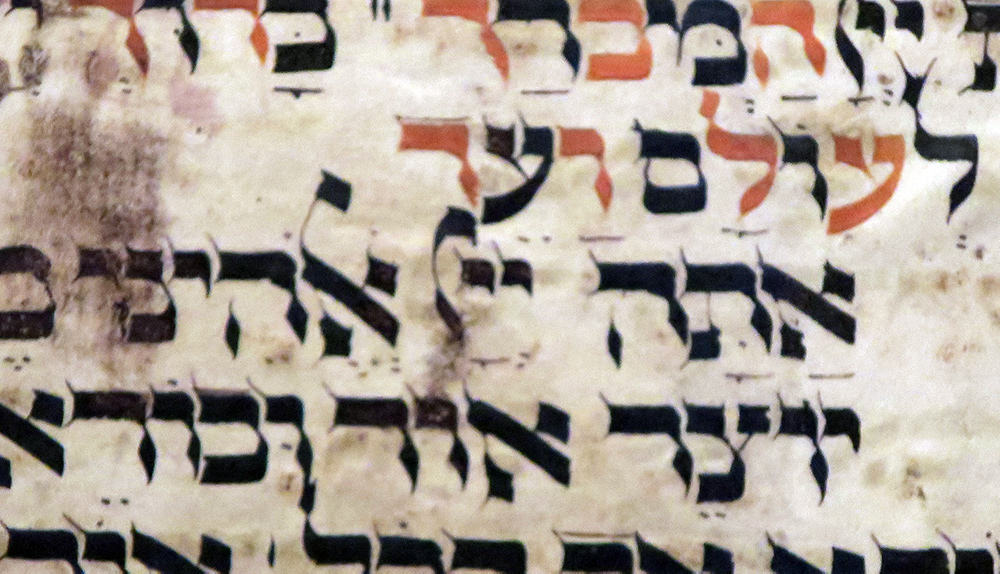
Another, less conspicuous verbal symbol also appears several times on this same prayer-book page, which is itself part of the exhibition The Colmar Treasure: A Medieval Jewish Legacy at the Metropolitan Museum of Art Cloisters (through January 12, 2020). In its own way, that symbol is no less striking than the aleph, at least to the unpracticed eye. It is this: instead of writing out the Tetragrammaton—the four-letter, never-to-be pronounced Hebrew name of God, the scribe has substituted two yods, followed by what looks like a swirly kind of lamed that has lost one of its legs.
Menachem Wecker.
In fact, the two-yod shorthand for the divine name (whose first letter is indeed a yod), is hardly uncommon in medieval manuscripts and early printed books. But what about that appended swirly suffix? As it happens, I knew the answer, having earlier encountered enchanting—and thoroughly confusing—visual manifestations of it not in in a literary but in an architectural context: to be precise, in two grand synagogues built centuries apart in time.
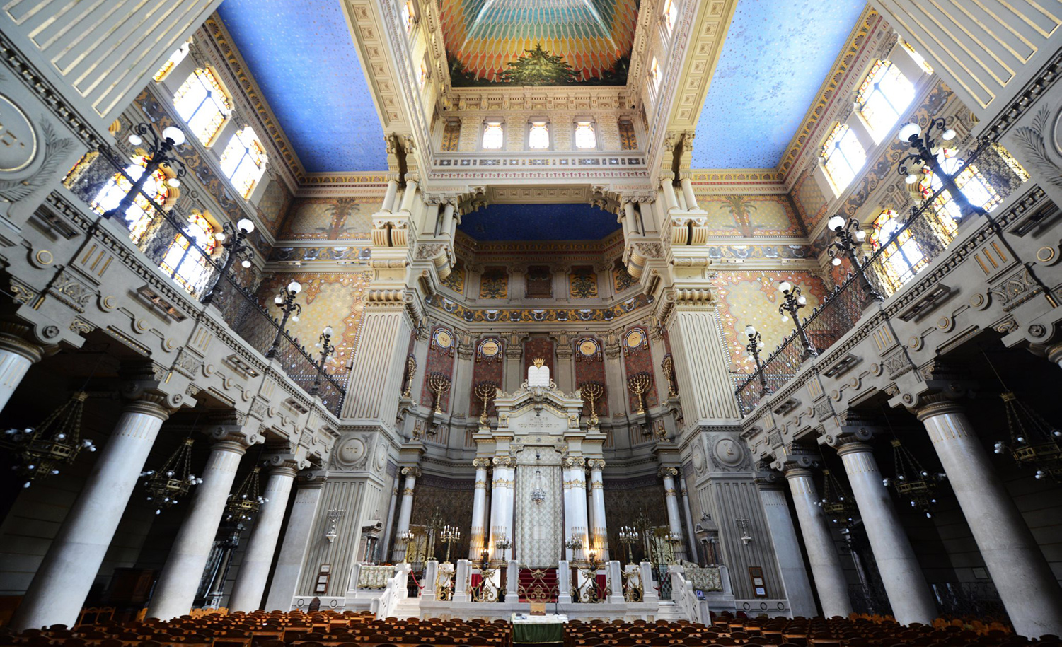
Sabbath-morning visitors to Rome’s majestic, early-20th-century Great Synagogue, the Tempio Maggiore on the banks of the Tiber, may find themselves hard put to follow the Italian rite—even if, like me, they already know most of the prayers by heart. Fortunately, there’s much else in this monumental sanctuary to focus on. During one such Sabbath service last year, soaking up the beautiful, otherworldly light pouring in through the second-floor balcony windows, I let my eyes rest on the marble columns and pediments of the niche enclosing the ark and its Torah scrolls.
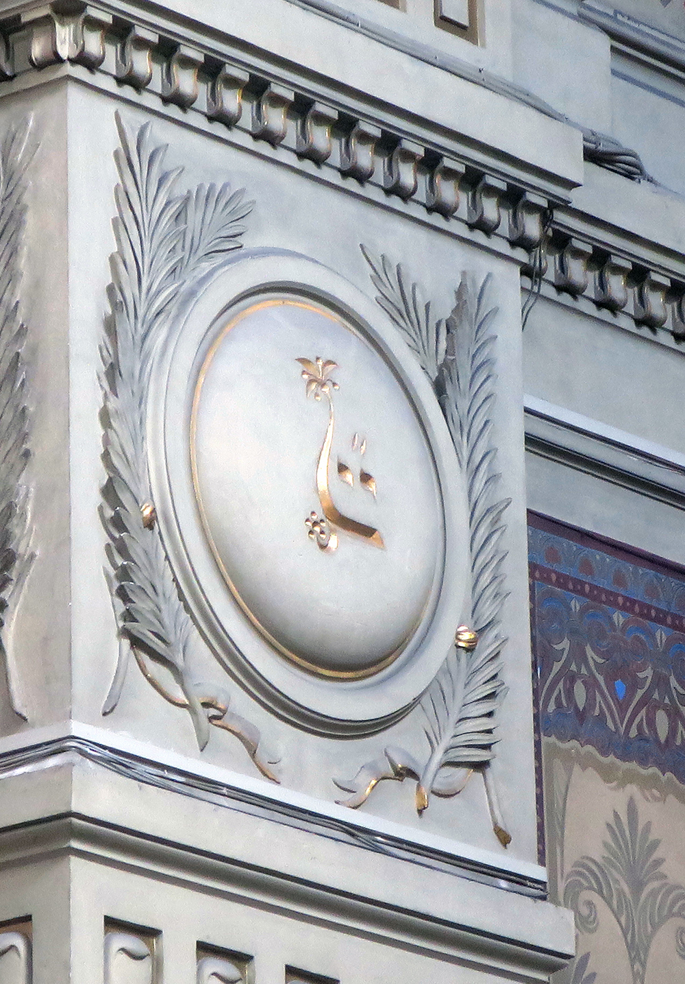
What gave me special difficulty was trying to decipher the Hebrew inscriptions incised in the decorated marble panels separating sections of the columns at the outer edges of the ark’s enclosure. One idiosyncratic form especially stood out: two curvy golden letters that, seeming at first to resemble Arabic, turned out instead to be those same two Hebrew yods. Underneath them, swooping from right to left and then upward, was a line culminating in the foliage of a date palm tree. (Think, in English, of an elegantly cursive capital “L,” its upright member topped by the tree’s leaves, with, for added effect, a small collection of dates nestling below.)
Menachem Wecker.
At first sight it struck me that, if this ensemble was meant to form a single word, its closest Hebrew equivalent might be yayin, or wine, at least if one granted a healthy dose of artistic license to the formation of what I took to be a final nun. After all, date palms and their fruits figure often in both the Torah’s narrative and its symbolic universe, and the palm was of course also a victory symbol in ancient Greece and Rome. Indeed, by the 1st century CE, as Steven Fine of Yeshiva University has written, the image of the palm came to represent “an attempt at accommodation between Rome and its Judean subjects,” with the palm frond referring both to classical victory and to the lulav associated with the festival of Sukkot.
But what was it doing in this grand Roman synagogue? My bewilderment only intensified when I remembered having seen a similar-seeming symbol in the Sinagoga del Tránsito, an edifice built many centuries earlier in Toledo, Spain. There, high up on Tránsito’s tan walls, heavily decorated with quotations from dozens of Hebrew texts, the same mysterious date tree appeared to have shed much of its foliage above and all of its fruit below. Did it, too, nevertheless recall the Hebrew word for wine?

Menachem Wecker.
The answer in both cases was of course no. Neither one had anything to do with wine, and that final swooping decorative “letter” was no letter at all but a signal, informing us that the preceding two yods were a form of abbreviation (along the lines, say, of “Mr.” for Mister, or “&c.” for etcetera). And in both cases the word being abbreviated, or rather symbolized, was that never-to-be-pronounced, four-letter Hebrew name of God. The palm-tree cipher was just that: a marker.
Taken together, these Franco-German, Italian, and Spanish linguistic configurations—and many others like them in books, paintings, and on synagogue walls—amount, I’m convinced, to a specifically Jewish innovation. In creating, embellishing, and particularizing a shorthand reference to the Tetragrammaton, Jewish artists (as well as Gentile artists under Jewish patronage) invented a new pseudo-word to represent God’s name in a way that skirted the prohibition in the Ten Commandments against taking the divine name in vain. They did so, in Rome and Toledo, in the Met exhibition’s manuscript page and elsewhere, with a pleasing aesthetic flourish that, simultaneously, invoked an ancient Jewish arboreal symbol.
What do we know about this practice? In an English-language book on sale in Tránsito’s gift shop, Jesús Peláez del Rosal of the University of Córdoba lingers on the extensive biblical verses decorating that building’s sanctuary, lauding the “elegant Spanish Hebrew” calligraphy that, in his view, imitates “the decoration of mosques with verses from the Quran.” But he doesn’t address our symbol at all, and in any case there does not appear to be an equivalent artistic practice in Islamic tradition, where divine names appear frequently on coins and in wall decorations.
Nor, in writings about this Jewish scribal effort to eschew penning (or carving) the ineffable name, have others tended to dwell on the practice as, specifically, a Jewish invention.
Thus, Jacob Lauterbach, in the 1930-31 issue of Proceedings of the American Academy for Jewish Research, tracked no fewer than 83 sets of shorthand symbols signifying the divine name. Samaritans and Hellenistic Jews, for example, would often change one of the name’s four letters to avoid writing it full; in early talmudic times, scribes often abbreviated words, including especially the divine name, by using just the initial letter, or the final letter, or a middle letter, making a single yod or hey into a stand-in for the whole; later in the talmudic era, two yods became standard or, still later, three.
“In the talmudic-midrashic literature, as far as I know,” writes Lauterbach, “no theory is ever advanced or even suggested to explain the use of these abbreviations or to attach a special significance to any of them.” But the numbers of substitutes continued to proliferate in the Middle Ages—hence his 83 examples with their variations, the latter of which include horizontal or vertical lines, additional dots, and more.
Although some scholars have theorized kabbalistic motives behind the later abbreviations, Lauterbach dismisses that idea. In his judgment, the proliferating symbols were the result of scribal misreadings of prior symbols, not attempts to improve upon them—which would have been a controversial move indeed for a post-talmudic scribe habituated to relying on the work of revered predecessors.
According to Lauterbach, the oldest of the post-talmudic configurations, dating to the 8th century, was a three-yod abbreviation. He cites the great Persian scholar and scientist al-Bīrūnī (973-1050), who noted this practice among Jews, as did the talmudist and Hebrew poet Tobiah ben Eliezer in the late 11th or early 12th century.
Another Jewish practice, this one of more ancient vintage and possibly connected with the Essene sect at Qumran, involved writing the full divine name, but in Paleo-Hebrew—the version of the alphabet used until the 5th century BCE—as a kind of “typographic” highlighting, whose purpose, in the view of the scholar Jonathan Siegel, was to alert the copyist to the word’s presence lest he inadvertently erase or pass over it. Still another scholar, James Edwards, points to a wall inscription in the late-3rd-century synagogue in Sardis (in what is now western Anatolia): a couple of letters with a horizontal line above them denoting a shorthand for the divine name: “perhaps the first certain example of a nomen sacrum [sacred name] in a written Jewish source.”
All in all, it seems there’s no denying something both new and, again, specifically Jewish at work here. The configuration at Tránsito in Toledo and in the Met exhibition’s manuscript from the Rhineland, and the modern palm-tree take on the same symbol in Rome’s Tempio Maggiore, should be seen less as markings pregnant with kabbalistic meaning than as both religious and aesthetic innovations—creative solutions to the “design problem” of needing to gesture to the presence of the divine name without writing it.
The theological implications of that design problem are fascinating. Arguably, the tremendous sanctity surrounding the ineffable name is what inspired, at least partly, the institution of the genizah: a storeroom for texts that Jews were forbidden to destroy lest in doing so they inadvertently transgress the prohibition in the Ten Commandments against taking the Lord’s name “in vain.” In a fortuitous (or miraculous) turn of history, the genizah would itself then contribute to the preservation of untold numbers of texts about whose existence we might otherwise never have known. And this is to say nothing about a parallel, underexplored set of questions, at once aesthetic and religious: how, exactly, is one to depict something that one is forbidden to articulate?
In facing such questions, Jewish scribes as well as Jewish patrons and the artists commissioned by them forged a new visual language. To savor some exceptionally beautiful instances of that visual language, just search out the manuscript page in the Met’s exhibition at the Cloisters or visit the Tránsito in Toledo or the Tempio Maggiore in Rome, or both, and look upward. You won’t be disappointed.
More about: Religion & Holidays